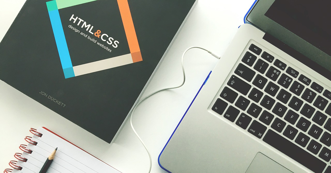
The internet is one of the best ways to get your brand, product, service or message out to the masses, but it is also easy to skimp on website design in lieu of getting something up quick n’ dirty. Sometimes this is the best first step, but don’t set and forget. Your website is the first impression users have of your business. Here are five crucial design mistakes that are costing you visitors and sales.
It’s Not Responsive
Responsive design may be the most important feature for a website. Your website needs to be accessible to everyone, regardless of the device they are using to access it. Automatic videos, background music and complex animations can slow down your site’s responsiveness with their clutter and load rates. Google even offers a free mobile-responsive test that will give you a list of issues and tips on how to resolve them.
Your Website is Too Slow
The longer it takes for your website to load, the more likely a user is to leave. As a general rule of thumb, you have about 3 seconds to capture your prospect’s attention. The rise of mobile has reduced this time gap while also shortening users’ attention spans. If you think that your website pages may be loading too slow, visit Google’s Page Speed Insights where you can analyze the pages of your website and get helpful suggestions on how to speed it up.
No Call to Action
Visitors to your site are looking for directions on how to deal with the information your site has just given them. Tell your audience what you want them to do. If you’re expecting your website to generate leads for your business, you have to have a clear call to action like a visitor intake form. If you want phone calls, your phone number needs to be prominently displayed at the top of the page and the click-to-call feature needs to be distinct.
Poor Images
Images that appear stretched or sized incorrectly instantly tell your site’s visitors that your business may not be as professional as you claim. It’s a sign of sloppiness and inattention to detail. Visitors base their judgment of your brand based on visuals and the ease of using your site, or User Experience for short. Images that look like they’ve been forced into a position or are not congruent with the rest of the site’s design are a big indicator that the rest of your experience on that site will not be beneficial to visitors.
Your Contact Email is Connected to an Unmonitored Inbox
If your contact page lists info@xxxxxxx.nyc, is that email being forwarded to and actual person who can answer it? An email address that has a name or position in it goes miles and miles towards bolstering the confidence the visitor has that their message will be seen, read and responded to, and therefore worth sending. Speaking of confidence and trust, an email address that doesn’t match your domain name is even worse. Ditch the general gmail, Hotmail and yahoo endings and make sure your contact email matches your domain name. Giving your visitors trust and confidence in your business goes a long way for increasing traffic, leads, and ultimately sales.


